A new look, the same values.
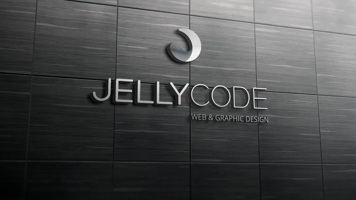
In the year JELLYCODE celebrates 5 years in business, we're also celebrating the launch of our new logo, which now stands for the new pulse of JELLYCODE — web & graphic design.
The new logo is made up of a symbol (the mark) plus lettering (the logotype). The symbol represents the fluidity, flexibility and resilience of the word "Jelly", and is paired with the company name ("JELLYCODE"), set in lettering that is rounded yet straight-edged at the same time — a balance between the demanding precision of code (programming) and the natural fluidity you'd expect from the creative side.
New as it is, the logo keeps the original colours: grey and red. That choice stands for the continuity of the values that govern and guide the culture of our business.
We hope you like our new look as much as we do!
Get what we write
No fixed calendar: only when there is something worth your time.