User Delight — The art of enchanting

Sandra Caravana – Copywriter – Design and emotion.
Writing and emotion.
Video and emotion.
My smartphone is prettier than yours.
I don't want this book to end.
This film is genuinely beautiful.
What do all these statements have in common? User delight. In other words: how our brain processes information emotionally — or, for the purposes of this piece, products and/or services.
Sandra Caravana – Copywriter – Design and emotion.
Writing and emotion.
Video and emotion.
My smartphone is prettier than yours.
I don't want this book to end.
This film is genuinely beautiful.
What do all these statements have in common? User delight. In other words: how our brain processes information emotionally — or, for the purposes of this piece, products and/or services. Rolex is about status.
Apple is about exclusivity and… everyone knows the joke that ‘Starbucks sells everything except coffee'.
What we're talking about here is the consumer experience. So why am I a consumer or user of a Rolex?
To tell the time. That would have been the perfect argument in 1988.
Today, owning a Rolex or drinking coffee at Starbucks is a statement. But how do you reach that status?
Many hours and a lot of money invested in marketing, neuromarketing and — ta-da — analysing the consumer experience: UX.
This is where the painstaking work of a UX Designer or UX Writer comes in.
But before we start skipping steps, let's look at the theory this profession grew out of. Don Norman's 3 pillars of User Delight
So is user delight about buying/using things because they look good? No. That would be underselling such a delicate concept. We don't have to buy. Using — or even just looking — is enough. It's beauty in the eye of the user.
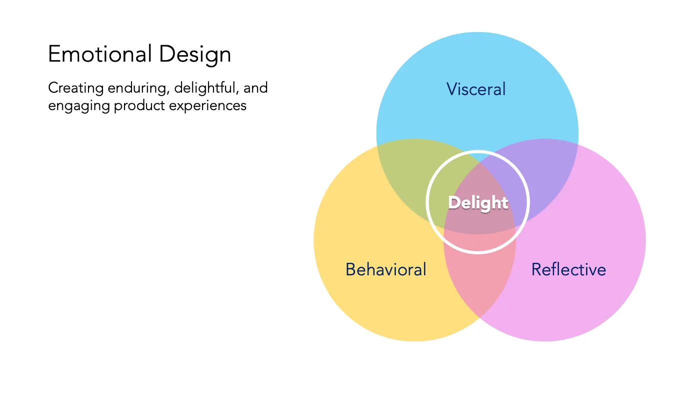
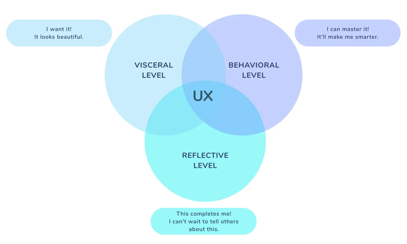
To begin to grasp this concept, we need to look at the three pillars — or levels — of user delight, so well explained by Don Norman, the father of UX. Source: Wikimedia Commons Don Norman was one of Apple's vice presidents and co-founder of the Nielsen Norman Group, an executive consultancy with a website every UX professional knows and draws inspiration from — We provide research-based UX guidance, by studying users around the world. Don Norman's work is built on bringing engineering theory together with social theory, and the result is everyday products. And the only way those products succeed is by creating an experience that pairs practicality with aesthetics — which is how the three pillars of user delight, of a pleasant experience, came about: Visceral, Behavioral and Reflective.

So let's look at what each level means, with examples drawn not only from products but also from graphic design services such as interfaces — with particular weight given to mobile apps.
Visceral Delight — The Visceral Level
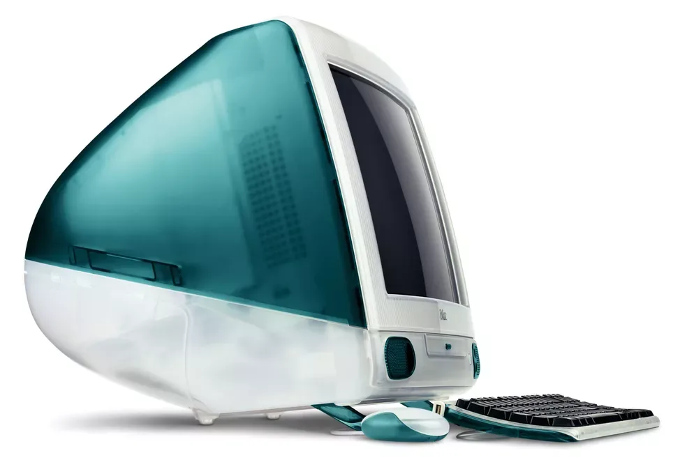
The name doesn't sound like it has anything beautiful about it. And since beauty is a relative concept, it doesn't bring us any closer to a sense of beauty either. Aesthetics and visual design play a very important part in how positively we perceive the product we're using or buying. Visceral here relates to our deepest feelings. Whether we decide something is beautiful or not is closely tied to the visceral level of our brain. Something our conscious mind doesn't spend much time processing, but it's there. It's using a water bottle as a flower vase. Does that make sense? Sometimes, yes. iMac G3 — the colourful model that boosted Apple's sales when it launched in 1998 It would be impossible to carry on with this piece without a classic Apple example: products known for their closed software system, but also for how they look. The object is sensual to our eyes. I'd go so far as to say some TV series have had their cinematography inspired by the apple brand. I long for the day I can drive a Mini Cooper designed in partnership with Apple. Aesthetics influence which product we choose and buy.
Picture Charles III's accession being signed with a Bic biro. A red flag would go up in our brain immediately, subconsciously, warning us that something was off.
The visceral level is also where all the colour theory sits. We learn it as children: red for something bad, green for something good. Red means don't cross the road and green legitimises our crossing, because even if we get run over, ‘it was green'. Traffic lights communicate something without a single word.
For anyone interested in this topic, read Palette Perfect by Lauren Wager. Or this.
I'm guessing your laptop wallpaper is a photo of your child, your pet, or your other half on a wooden swing with a breathtaking landscape behind them. Did I get it right? Or it might be an image pulled from Pixabay that relates to your job: a vintage typewriter, in nude tones. But do you remember the wallpaper on your laptop when you bought it? And what goes for laptops goes for smartphones. If you've recently bought a MacBook, with a bit more curve or a bit less, a bit more purple or a bit less, your original wallpaper looked like this: Source: BR Atsit Remember the Windows Vista launch in 2007? The official wallpaper also gave us an image of mountains: Source: Wallpaper Abyss What do they have in common? Pleasant images, easy on the eye. Nobody deserves to switch on a brand-new laptop and have their irises assaulted by a motorway-sign neon.

Disclaimer: colour-blind readers, fear not! Colour Is for Everyone!
Behavioral Delight — the behavioural level
Are we all terribly vain? Yes. Is that the only thing that matters in our choices? No. The iPhone wouldn't be a success if it had the most complicated operating system in the world. Quite the opposite: with every new smartphone launch, Apple tries to make its software as intuitive as possible. Behavioral design is therefore a synonym for usability here — the very practicality Don Norman, and Apple, value so highly. It's the easiest level to test and to prove. The best example: shoes, of any kind — high heels, loafers, trainers, running shoes, even a pair of Josefinas, because we all have brands we prefer. And they're our brands of choice because they combine good-looking footwear with comfort. It's also a question of control, of choice. I'm going to run the marathon in these trainers. I'm going to buy an electric car.
For a designer to reach that point, there's a lot of research to do: behavioural science, behavioural economics, neuroscience and psychology. It's about taking the insights from those fields to understand how people behave. Understanding the 600 pages of Daniel Kahneman's Thinking, Fast and Slow rests on the premise of two systems of thought:
- System 1 operates automatically and quickly, with little or no effort and no sense of voluntary control.
- System 2 allocates attention to the effortful mental activities that demand it, including complex computations. The operations of System 2 are often associated with the subjective experience of agency, choice and concentration.
Kahneman, D. (2011). Thinking, Fast and Slow. Círculo de Leitores
At this point, we can see that the visceral pillar of design sits in System 1, while the behavioural level sits in System 2. And we've been living with this system since nursery school.
Little Johnny never tidies up the area he plays in every morning: the kitchen corner. Joana teases him and points out that, since she puts away all the cars in the garage corner, she's a well-behaved girl and he isn't. So the teacher decides to create a chart handing out points and rewards to whoever meets all the day's targets. Smiley faces, sad faces, stars, crosses… the visual design is down to the teacher, but it will influence Johnny's behaviour. Why? Because that image has a meaning and a purpose: to touch our emotions to the point where we change a behaviour. Next scenario: your favourite homeware shop has an app. Brilliant. It's like having a whole shop in your hand. It's practical, it's easy, it's simple. And the app is so good-looking… you want to buy the products and the app.
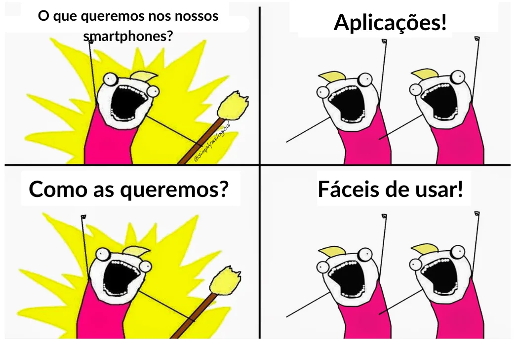
We get the following notification on our smartphone: IT'S HAPPENING! Unbelievable discounts have landed! Get in there and get your home ready for Easter lunch! (because the company has a great data analysis strategy and knows the customer is Catholic).
We open the app and go straight to the offers tab. Everything goes in the basket! We want to check out. We can't. Why? Because they didn't invest in an app with full e-commerce functionality. We have to complete the purchase on the website. We move to the laptop, because it's easier. We log in, accept the cookies and go to the basket. There's nothing there! We go back to the offers tab and can't find the items we wanted because, in all likelihood, they've sold out in the meantime. Sound familiar? How does it end? We give up on the purchase.
The designer's effort and dedication is abandoned right there. Like an online shopping basket.
Reflective Delight — The Level of Recognition
We're back to Kahneman's System 1, but let's not forget we've already been influenced by System 2. This is the level where our values, our history and our life goals are stored — our identity. It's the small voice in our head. It's having the money to buy a Rolex and deciding to buy a Casio instead. It's the way we mirror our decisions. Source: Muzli – Design Inspiration So is that the recipe for a pleasant, perfect user experience? No. There are no magic recipes, because we can't please everyone. But we'll give it a go! Source: Pathum Goonawardene UX professionals try every single day, whether they work in design or in writing. The cherry on top of the cake would be putting UX Designers and UX Writers around the same desk. When that doesn't happen — because the myth that a marketing professional does everything is still doing the rounds — the most common mistakes with interfaces, mobile apps included, are:
- Site not optimised for mobile (and vice versa, to be fair): if we can't see the images and can't read the information, we don't buy.
- Confusing interface. Too many tabs, too many colours, garish colours, too many windows opening without us asking for anything.
- Nothing matches up. Scrolling through social media, you've surely come across an ad for a nice, useful backpack for carrying your laptop around. But the nightmare begins when you click the ad — perfect CTA — and, instead of a page with more information about the product advertised, up comes the multi-brand shop's homepage, where the user still has to search for the item from the ad, which they don't really need that much, but which the ad has made them want to buy. Where's the product? Houston, we have a problem.
But don't imagine that mistakes are only measurable in the virtual world. How many remote controls do you have at home? For the TV and the set-top box, certainly. Covered in buttons, some of them coloured. Easy to use? Not always. The news is on? Rewind. Is it easy? Is it intuitive? Did you manage to stop at exactly the right moment, or did you have to try several times? But the remote looks nice, doesn't it? Where does Netflix's success (also) lie? Netflix saves the point in the film where we stopped or paused. When we open the app again, we don't have to look for anything — we just hit play. We don't rely on wristwatches to tell the time.
Selling perfume on television doesn't seem to make much sense.
The old ID card didn't fit in our wallets.
We're delighted every time we walk into a room where all the decorative elements are in harmony. We want ours to look like that.
We're delighted when our favourite clothing brand's mobile app, even a low-cost one, is so easy and intuitive that it feels like walking into a Prada in Paris with a personal shopper.
A pleasant user journey starts with the first impression, just like a first date. It runs through practicality, with the product or service able to align with the user's values. These are smart selling strategies, where the design team is focused on the customer, not the product. We don't rely on wristwatches to tell the time.
Selling perfume on television doesn't seem to make much sense.
The old ID card didn't fit in our wallets.
We're delighted every time we walk into a room where all the decorative elements are in harmony. We want ours to look like that.
We're delighted when our favourite clothing brand's mobile app, even a low-cost one, is so easy and intuitive that it feels like walking into a Prada in Paris with a personal shopper.
A pleasant user journey starts with the first impression, just like a first date. It runs through practicality, with the product or service able to align with the user's values. These are smart selling strategies, where the design team is focused on the customer, not the product.


Get what we write
No fixed calendar: only when there is something worth your time.